Wednesday, November 25, 2015

Field Journal #9

Hi everyone,
Happy Thanksgiving!

So this week's journal is similar just like last week. 

I like the Art works and designs by Emil Ruder. 
Emil Ruder was a typographer and graphic designer. He was born in 1914 in Switzerland. 
One of the designer that establish the style of design -- Swiss Design. 
His and Armin Hofmann, formed the Basel School of Design. 
His believes that typography's purpose was to communicate ideas through writing.
Ruder especially with his typography, he used heavy importance on sans-serif typefaces and his work in both clear and concise.
Ruder's work has contrast between two opposite colors. Not only the colors contrast but the lining of the works. The simple lines creations with figuring. The first graphic is the elephant.
I think Ruder's art influences many of our current designers. As I found many of art has the similar design from Ruder.  


Wednesday, November 18, 2015

Field Journal #8

This week I have explored around the logo.
As I drove around the city trying to find ideas I found Shell gas station.
So I went to research about Shell logo, why it has to be the "Shell".

http://www.shell.com/global/aboutshell/who-we-are/our-history/history-of-pecten.html


The Shell has significant changed between 1930 and 1948. And in 1948 the Red and Yellow, the main colors we use to identify the Shell, are set for the logo itself. As we see the less detail and seashell figures become more identical and less detail but more symbolized. 

Wednesday, November 11, 2015

Field Journal #7

Hi, everyone!
Winter time arrived, stay warm :)

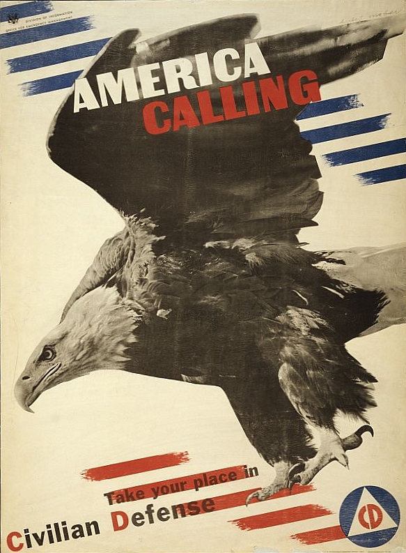
So this week is I focus on Herbert Matter's works.
Matter is famous by the approaches to the photography with visual organization.
According to http://herbertmatter.org/welcome
Matter is a man of genius, his artworks and influence of the visual impact to modern designing world.

Resource: https://upload.wikimedia.org/wikipedia/commons/c/c0/Herbert_Matter_World_War_II_poster.jpg
The example as above, the American Eagle in the poster as an recruitment for defense.
It's something consider new compared to the previous poster designing.  
Matter's photography is also different from the mainstream.
http://herbertmatter.org/welcome/photography

His image is more partial detail from overall. You would see the theme is more focus in the center.

This week's reading is about Bauhaus and the new typography. I really like how the changes of the designing. 
The new graphic design has visual appearance, much more on 2D image. the shadows details and the image has more power. The layout is much more creative. Interaction between photo and the lettering created the much more unique image.  

I think this week is really interesting reading. Never know that all the graphic design changed this much with this many of movement.

Wednesday, November 4, 2015

Field Journal #6

In this week's reading, I have see more familiar art works.

The art works are more like we would see in the history textbook.

The famous one is the Uncle Sam for military duty. Also during the cold war the propaganda.

This is what my country's propaganda of the Spy from the Communism.
I said it's really interesting to see the overlapping and common between different country.
I compared with my country -Taiwan with China and the United States, I have found many similarity.

In the other two chapters, I see the modern art as fundamental.
The most famous will be Pablo Picasso.
But for this week's reading I really focus more propaganda for the war fare related.
I did some research on the propaganda

We could see the similarity of the propaganda, the leaders or the symbolic that represent the country. In one of the art you clearly see the children are used for propaganda during the WWII when Germany, Italy, and Japan are allied. It's clearly showed that not only the leaders would be used as Art symbol so does the woman and children.

As I did more research about Taiwan and China civil war, which at the time involving with the United States


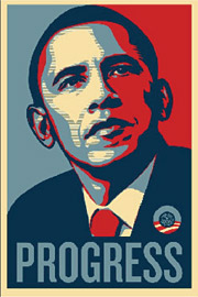
This type of propaganda are used less in the modern time but some does come back because the old vintage is part of the Art form.
Like the Obama campaign on the old art that we see are influenced by the time. 
I would said this week's reading is really interesting. I see how our daily life are still impacted by the art. Its more understandable and more reasonable than past weeks' reading.