Sunday, December 6, 2015

Field Journal Final Reflection

Once in a while we will see the Graphic Design went back to vantage. It’s really hard to say which one is better than other. When it comes to comparison, the present work will definitely well than the past. Due to the current technology, the art design will go beyond the imaginations as you compared with Middle Age Renaissance Baroque era. The art works have improved from weak to extreme detail.
I think there is no way to determined which is better because the technology has been improved so much and so great. Without the Middle Age, Renaissance and Baroque, we as human being won’t have this advanced technology world.
First the technology is not in same level, the tools and equipment are not in the same standard to be compared.
Second, the arts thought and the environment are different compared both present work and any era in the Middle Age. The different has created none compared conditions.
And last but not least, what current Graphic Design are based on the past Graphic Design. The typography from century to century, the art minds and thoughts, colors and materials, the judgements of the arts. Everything aren’t in the same standard or began at same level, it’s no way to compared both present and Middle Age.
 I think one of the important is different period’s graphic design contained their unique characteristics. Without those different and characteristics there is no way we to identify the differences between them. Without those differences we won’t be able to know the events for either pasts, presents or possible futures.
Throughout this class I have learned so much about Graphic Design, understanding the background and history will helps me to get more inspiration. This class is really fun and full of interesting art works for me to explore around. It has opened my eyes and mind into another level in the Graphic Design world. I am really grateful for taking the class with many talented classmates. 

Wednesday, December 2, 2015

Field Journal #10

Hi everyone,
It's almost final and can't believe quarter almost end.
This week's reading I have found really interesting designer from local.

Michael Vanderbyl,
grow from local, born and raise in Oakland California. Vanderbyl is a multidisciplinary designer in the San Francisco Bay Area, is the principal of Vanderbyl Design.

His work has expand from different fields such as designing furniture, products, showrooms and retail spaces. Vanderbyl has clients from Espirt, Baker furniture, The Walt Disney Company, IBM, AmericaOne,Robert Talbott, Teknion, The Blackstone Group and Luna Textiles.  Although his main focus is on the Furniture and show cases but his art design have really interesting feature. 


This reminds me a game called Monument Valley. An illustration game of different side of box. 
Bike and smile. The colors show the environmental friendly and new view.

Seeing his work really inspiring to me because the art work is really unique and with detail features. I like the colors and layout. I think Vanderyl has really interesting design vision compared to other designer.


http://www.vanderbyl.com/

Wednesday, November 25, 2015

Field Journal #9

Hi everyone,
Happy Thanksgiving!

So this week's journal is similar just like last week. 

I like the Art works and designs by Emil Ruder. 
Emil Ruder was a typographer and graphic designer. He was born in 1914 in Switzerland. 
One of the designer that establish the style of design -- Swiss Design. 
His and Armin Hofmann, formed the Basel School of Design. 
His believes that typography's purpose was to communicate ideas through writing.
Ruder especially with his typography, he used heavy importance on sans-serif typefaces and his work in both clear and concise.
Ruder's work has contrast between two opposite colors. Not only the colors contrast but the lining of the works. The simple lines creations with figuring. The first graphic is the elephant.
I think Ruder's art influences many of our current designers. As I found many of art has the similar design from Ruder.  


Wednesday, November 18, 2015

Field Journal #8

This week I have explored around the logo.
As I drove around the city trying to find ideas I found Shell gas station.
So I went to research about Shell logo, why it has to be the "Shell".

http://www.shell.com/global/aboutshell/who-we-are/our-history/history-of-pecten.html


The Shell has significant changed between 1930 and 1948. And in 1948 the Red and Yellow, the main colors we use to identify the Shell, are set for the logo itself. As we see the less detail and seashell figures become more identical and less detail but more symbolized. 

Wednesday, November 11, 2015

Field Journal #7

Hi, everyone!
Winter time arrived, stay warm :)

So this week is I focus on Herbert Matter's works.
Matter is famous by the approaches to the photography with visual organization.
According to http://herbertmatter.org/welcome
Matter is a man of genius, his artworks and influence of the visual impact to modern designing world.

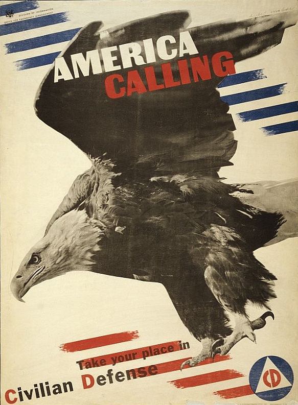
Resource: https://upload.wikimedia.org/wikipedia/commons/c/c0/Herbert_Matter_World_War_II_poster.jpg
The example as above, the American Eagle in the poster as an recruitment for defense.
It's something consider new compared to the previous poster designing.  
Matter's photography is also different from the mainstream.
http://herbertmatter.org/welcome/photography

His image is more partial detail from overall. You would see the theme is more focus in the center.

This week's reading is about Bauhaus and the new typography. I really like how the changes of the designing. 
The new graphic design has visual appearance, much more on 2D image. the shadows details and the image has more power. The layout is much more creative. Interaction between photo and the lettering created the much more unique image.  

I think this week is really interesting reading. Never know that all the graphic design changed this much with this many of movement.

Wednesday, November 4, 2015

Field Journal #6

In this week's reading, I have see more familiar art works.

The art works are more like we would see in the history textbook.

The famous one is the Uncle Sam for military duty. Also during the cold war the propaganda.

This is what my country's propaganda of the Spy from the Communism.
I said it's really interesting to see the overlapping and common between different country.
I compared with my country -Taiwan with China and the United States, I have found many similarity.

In the other two chapters, I see the modern art as fundamental.
The most famous will be Pablo Picasso.
But for this week's reading I really focus more propaganda for the war fare related.
I did some research on the propaganda

We could see the similarity of the propaganda, the leaders or the symbolic that represent the country. In one of the art you clearly see the children are used for propaganda during the WWII when Germany, Italy, and Japan are allied. It's clearly showed that not only the leaders would be used as Art symbol so does the woman and children.

As I did more research about Taiwan and China civil war, which at the time involving with the United States


This type of propaganda are used less in the modern time but some does come back because the old vintage is part of the Art form.
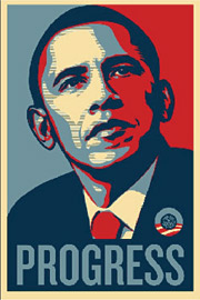
Like the Obama campaign on the old art that we see are influenced by the time. 
I would said this week's reading is really interesting. I see how our daily life are still impacted by the art. Its more understandable and more reasonable than past weeks' reading. 


Thursday, October 29, 2015

Field Journal #5

Hello Everyone~
Sorry, I was busy with my other midterm and forgot to release this week's Journal. 
I hope everyone is doing well and not getting sick like I did early this week. 

Doing this week's reading for chapter 11 and 12, I have found significant different from last week.
This week is more like two cultures cross influences each other and new creation, also seeing the Female and male figures have different representation in the art.

Before I went too off topic, this week reading has one of my favorite art.
The famous Japan art collection -- Ukiyo-e  
浮世絵). I was happy when I see it as part of reading.
Especially my favorite one The Great Wave off Kanagawa  by Hokusai in 1831.

I never know Ukiyo-e was influenced by Western culture. I was totally amazed by the creation of two cultures have produced. The influence of Western and Eastern does bounced with each other and created something that's new and still liked by modern world.
I have found the similarity of from both Western Eastern is the usage of colors. The choice of colors made it different from before. It's more like what we would use in our daily. Also the contraction of shades and brightness makes the details more outstanding and easy to define the overall Art.
One of the thing happens I think it's unique is the different gender has different role playing in different Art form.

Females figures have much more variety of roles than male figures which is different from before. More females figures as the main Art works. 
Not only the character changed but the color usage and contraction between same color have much more define. The shades and brightness brought out more details which is what we didn't see before. This is like we can use same colors creating much more different coloring effect in one single Art works.

In chapter 12, I found the book art has developed into different level that is really surprising.  
I see the detail on the typeface and layout of the context. 
Not only the change of typefaces and layouts but also the color and contraction. The art work with different typefaces not making weird but bring out more elegant. Each has different purposes as typeface and layout changed when the content stayed the same.
My favorite will Dutch architect J.L. Mathieu Lauweriks. He used the Geometric patterns in the books. which we have seen it much more common during our time. Plenty of the books have used it as part of their content layouts. 


I feel like this week's reading telling me about creating under influences and different materials. 
We would never know what would creating before we doing it and create it out.

Wednesday, October 21, 2015

Field Journal #4

Another week of interesting reading~

During this week's reading I found many things that are still used in our daily life.

The printing Technic, the layouts.

It's still use in our designing system. I remember during my summer intern in Taiwan I have encounter few of the concepts.

From both chapter reading I can connect it back to my T Shirt design class back in the Spring 2015.
I have learned that halftone and screen printing was the main printing process.
Even till now screen printing is still one of the way to print good quality and valuable crafting items.

I see how halftone create the color differences. Also how important is the layout of the print.


I feel like the crafting is still as origin as it was but now we have add some more new things into it.

Binding the new and old created another different style. Like poster making we like to see something old but we also want something new.

As I reading the Chapter 10, I found that American Type Founders Company (ATF) has played important role for the typeface and typographic.

Like the reason Google change the logo typeface.
http://www.bbc.com/news/magazine-34126251

This week reading is just so interesting that I have to go back and forward to see how much it has change.


Wednesday, October 14, 2015

Field Journal # 3

Hi everyone~
Hope everyone had a wonderful weekend !

I know it's Midterms week for most of other people but hey we are almost there~


This week's readying I found many things that interested me. As I am reading the textbook I was amazed and glad I have chose to take this class.

I have learned the today's typography and illustrated books are mostly preset back in 15th century.
The major turn point is the Renaissance, which all the major change for modern setting occurs in this era.

I think French king Louis XIV is important because he has set the most of the alphabets with the statistic. So the sort link me back when I see the Shishedo video ]
https://www.youtube.com/watch?v=32d91e9UN6A

But I think the most important for typographic will be the modern style. From Giambattista Bodoni, he is an young man and son of an indigent printer. Without him the Roman style or the similar style won't stand long. We can see how those are past down and surprisingly we are using it everyday in our daily life. Not just for graphic designing but many other arts are using it.


I think this week's reading is unique. I like to see how it has change from certain period to another.
The process start to make me think how other design will we left for our future or how the old design impacted us without we notice the effect.

Wednesday, October 7, 2015

Field Journal #2

after reading the ch1-4, I like the alphabets and Asian contribution the most.

It shows how languages was kept and pass down.


I was glancing through the book I have see some are really familiar from the old history textbook from 6th to 12th grades.

Also when I look at the Alphabets I can see the languages origin from. I have notice the alphabets are used in our daily life. It's just amazing how those graphic design is used commonly and linked to our life.


I have some technical issues so I wasn't able to upload my pictures to finish my journal I will try to see tomorrow.

Wednesday, September 30, 2015

Field Journal # 1

Hi Everyone ~
Welcome to my blog!


My name is ChiaHung Liu, most people called me Eric. 

I am international student from Taiwan, this is my last year before I finish up my AA degree on Graphing Design.

It's my first time creating an "Artist" type of blog. 


Hoping you guys will enjoy it. 


I like to travel around also visit different art museums, hopefully one day I will visit Rome and other places in Europe.

Over the summer, I have a short intern with friend's relative designing studio in Taiwan. 

It was a pleasure to work with some one who is in the field.

I hope I will gain different perspective after this course. :]